|
Origins of the Ananda logo After a long journey through the story of J. D. Walters and of the Ananda communities, we are now able to present some information, telling us about the origins of Ananda. Thanks to the collaboration of a few people, we received information and documents on the origins of the Ananda Logo. We believe that you will be surprised, just like we were. Kriyananda stated and wrote repeatedly that he saw the Ananda logo while in meditation, and from that inspiration he was urged to create the little trademark that even today identifies the community and its activities. This is the picture that identifies it, taken from the Ananda website:
According to his account, after the dismissal from SRF he lived for a
while in San Francisco, where he taught at the School of Doc. Harida
Chaudhury, at the Cultural Integration Association.
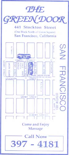
This is the visiting card of a well-known massage centre, situated right in San Francisco City, that provides a certain type of services, clearly advertised on magazines and websites of that field. Their guides quote more or less as follows: review taken from the website http://www.adultspy.org/sfo-root.htm
PLACES TO AVOID---
As you
can see, it is a place which has nothing to do with spirituality, nor with
yoga, yet someone claims something weird, and that is to say that their
Logo and the one of Ananda are the same!
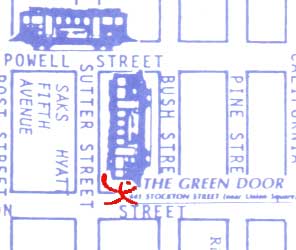
At the
beginning the original Logo was not laid upon with the drawing of the
“Trolley car”.
There were members
of Ananda that saw the original Green Door poster without any "Trolley car"
over.The
owners of the Green Door were contacted by Ananda, and after that call
they had to cover up the logo to avoid trouble.
From searches performed by specialists in the field of trademarks, we have learned that this logo already existed in 1960, nine years before Ananda was established, and therefore we are allowed to wonder whether it could be the result of a vision of Kriyananda’s, since at that time it was printed on the visiting cards of the Green Door. It appears both the two symbols are referable to a satanic cult active in New York in the fifties, called “The Lightbearers”. The same term that at Ananda means “bearer of light” and is assigned to the disciples who follow the path to become ministers. For those who want to have a look at the original visiting card we supply the following link. Download the original picture of the Green Door Visiting Card (1,09 Mega - .zip format)
| Home | Archives | Unofficial Documents | Links | Gallery | Bibliography| Mail |
|
|